Inspired
by
discovery.
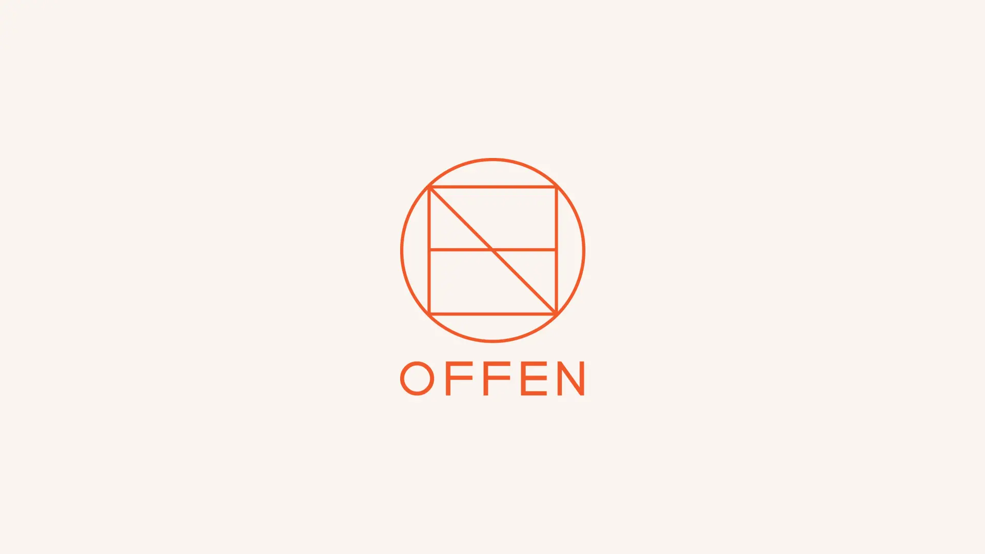
Offen
Brand Identity
Offen is a retail platform built around discovery — curating products from around the world into a simple, destination-inspired shopping experience.
The identity was designed to reflect that sense of movement, exploration and ease, while remaining clear and functional across digital touchpoints.
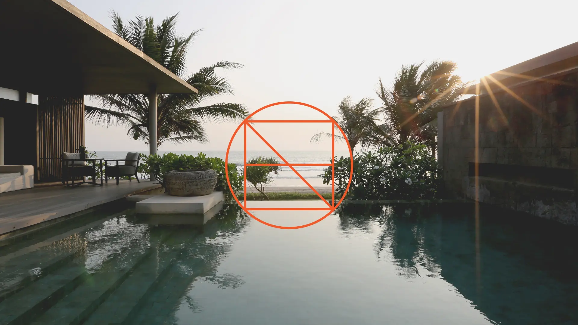
At the centre of the system is a geometric wordmark, with each letter held within the curve of the “O” — creating a distinctive, contained form that feels both structured and welcoming.
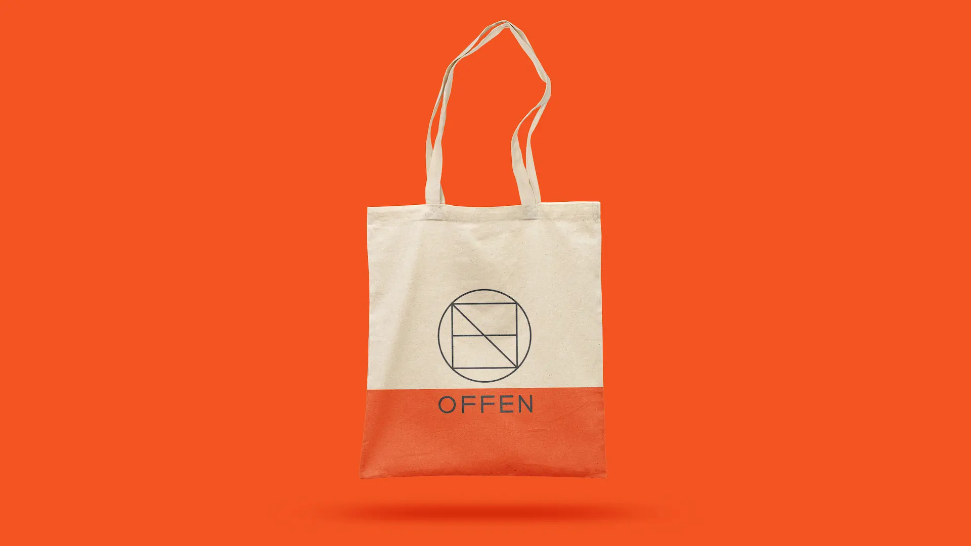
The result is a mark that works consistently across applications while retaining a sense of personality and cohesion.
A warm, sun-washed colour palette draws from travel — referencing light, landscape and atmosphere rather than specific locations.
Used sparingly, it creates a visual language that feels premium, relaxed and adaptable across product categories.

Designing a brand for movement.
The challenge was to capture the spirit of travel without relying on cliché.
Every element was designed to feel effortless but intentional — balancing expression with usability, and character with clarity.
A brand designed not just to represent travel — but to feel like part of the journey.
Shaped by curiosity.
Tell us what you’re building, launching or trying to explain. We’ll help shape the idea into something clear, useful and memorable.