Recognised,
remembered
and trusted.
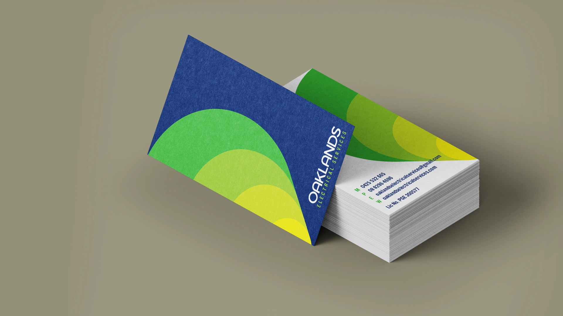
Oaklands Electrical Services
Brand Identity
Oaklands Electrical Services is a local Adelaide business delivering residential and commercial electrical work.
The identity was designed to do one thing well — create a clear, professional presence that builds trust quickly and stands out in real-world environments.
Clarity first.
For service-based businesses, recognition matters.
The logo combines a simple geometric form with layered colour — creating a distinctive mark that reads clearly across signage, uniforms and vehicles.
It’s bold enough to stand out, but controlled enough to feel reliable and professional.
Designed for the real world.
The identity was built to work where customers actually see it.
From vans and shirts to business cards and digital touchpoints, every application was considered to ensure consistency and visibility at a distance, in motion and across different lighting conditions.
The result is a system that performs beyond the screen.
Consistency at every touchpoint.
A restrained colour palette and clean typographic approach create a cohesive, flexible brand system.
A brand designed not just to look good — but to be recognised, remembered and trusted.


Shaped by curiosity.
Tell us what you’re building, launching or trying to explain. We’ll help shape the idea into something clear, useful and memorable.