Too different
to be
stock.
Human Image Design
Campaign
Stock imagery is built for broad appeal.
Human Image Design was created for the opposite — imagery defined by the specific needs of a brand.
The challenge was to communicate that difference clearly, without defaulting to technical explanations or feature-led messaging.
Reframing the category
Rather than positioning Human Image Design against stock on cost or convenience, the campaign reframed the conversation around control and intent.
The idea was simple: “Too ________ to be stock.”
A modular line designed to highlight the limits of generic imagery — while demonstrating the flexibility of a design-led system.
Each execution explored a different attribute:
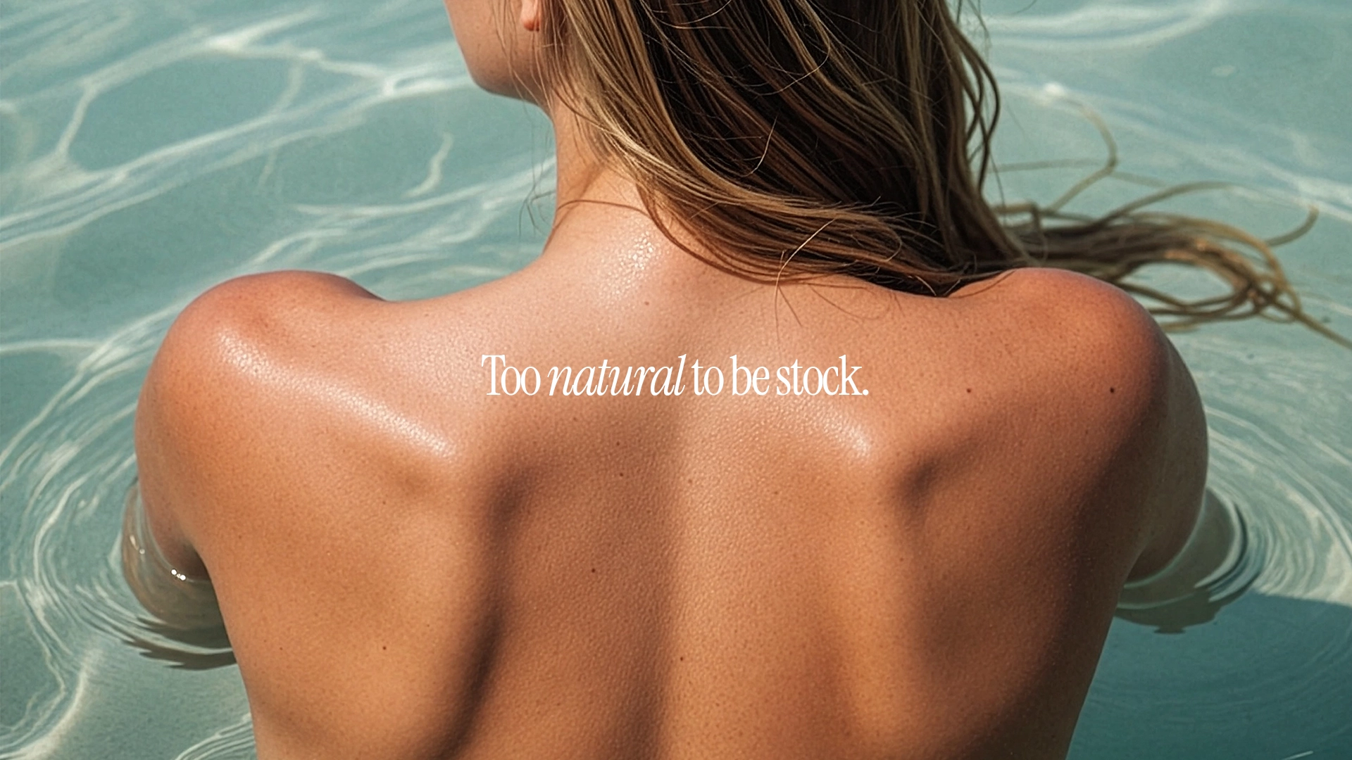
Too on-brand.
Too natural.
Too specific.
Too considered.
Too consistent.
Together, they build a clear argument — that imagery should be shaped by the brand, not selected from a library.
A system, not a individual executions.
The strength of the campaign lies in its repeatability.
The structure allows for ongoing expansion, with each new word introducing a different perspective on the same core idea. This creates a flexible content system that can adapt across industries, formats and platforms.
From single-frame executions through to motion-based social content, the idea remains consistent while the output evolves.
Designed to demonstrate, not just tell.
A campaign designed not just to challenge stock — but to replace the way brands think about imagery.
Shaped by curiosity.
Tell us what you’re building, launching or trying to explain. We’ll help shape the idea into something clear, useful and memorable.